Graphical User Interfaces
Using Python
tkinter
Dr Ian Cornelius
tkinter Module (11)
Widget Attributes vi
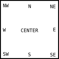
Anchors
- Anchors are constants to control where items are
positioned relative to their context
- i.e. an anchor can specify where a widget is located inside a frame
- The constants are given as a compass point
- i.e. north is top and west is left
tkinter Module (12)
Widget Attributes vii
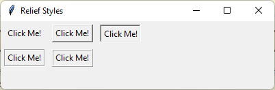
Relief Styles
- Provides a simulated three-dimensional effect around the outside of a widget
- The width of the borders are dependant upon the
borderwidthoption
tkinter Module (13)
Widget Attributes viii
Bitmaps
- Bitmaps can be used to add icons to buttons etc.
| Bitmap Value | Icon | Bitmap Value | Icon |
|---|---|---|---|
error |
 |
gray75 |
 |
gray50 |
 |
gray25 |
 |
gray12 |
 |
hourglass |
 |
info |
 |
questhead |
 |
question |
 |
warning |
 |
- Your own bitmap icons can also be used, using the
file extension
.xbm - Instead of using a string from the table above,
provide a string with the following:
@symbol- path to the bitmap file
@directory/file_name.xmb